Ah! The long-awaited post on our paint color choices! Did you think I’d forget? Uh, whoops… Sorry!
We chose some really lovely muted tones for throughout the house because we are planning to accessorize with pops of color and wanted fairly neutral backgrounds in which to do so. We couldn’t be more pleased with how all the colors turned out.
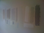
As you can see from a previous post, Paints galore, we experimented with a lot of shades, which was fun. I strongly recommend, for anyone hemming and hawing over choosing paint colors, to narrow down to what you think are your top two or three colors and buy the small samples. If you don’t want to paint your test splotches directly on the wall, buy a large piece of poster board to test on and throw away later. What I like about doing the poster board is that you can also move it around the room and view it in different places at different times of day. You’ll be surprised by how different a color can look when it’s actually in your home in a certain room during the day or in the evening. The amount of natural light, recessed lighting, flooring or carpeting can all affect how a color looks once it’s on the wall.
Here are our color picks for our modern renovation:
-

- Shoreline 1471 (Benjamin Moore, Classic)
-

- Paper White 1591 (Benjamin Moore, Classic)
-

- Coventry Gray HC-169 (Benjamin Moore, Historic)
-

- Cornforth (Farrow & Ball)
-

- Chantilly Lace OC-65 (Benjamin Moore)
-

- Blackened (Farrow & Ball)
-

- Arctic Gray 1577 (Benjamin Moore, Classic)
Look for the final reveal photos soon!


 Posted by Pretty Neat Organizing